| Metric | Value | vs last month | vs a year ago |
|---|---|---|---|
| Average trips per day | 268,224 | -2.6% | +12.1% |
| Active drivers | 61,681 | +2.2% | -0.7% |
| Logged-in drivers | 69,556 | +1.7% | -10.3% |
| Drivers full time (>= 240 trips) | 20.6% | -0.4 pp | +3.2 pp |
| Trips by full-time drivers | 59.8% | +0.2 pp | +7.1 pp |
| P1 time (available) | 25.7% | +1.2 pp | -16.1 pp |
| P2 time (en route to pickup) | 15.7% | -0.0 pp | +5.8 pp |
| P3 time (on trip) | 58.6% | -1.2 pp | +10.2 pp |
Introduction
This set of charts uses the City of Toronto’s open data to explore trends in the Greater Toronto Area ridehail system. For information about the data sets, see Dashboards home page.
This month at a glance
Table 1 lists headline numbers for July 2026, together with comparisons to last month and to a year earlier.
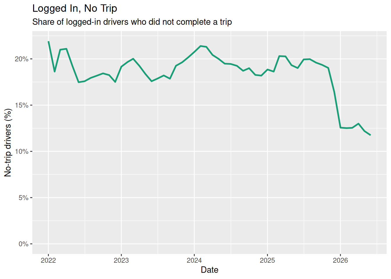
An active driver here is one who completed at least one trip during the month, the same definition the Chicago table uses. In July 2026, 21% of them reached the full-time boundary of 240 trips. A further group of drivers logs in without ever picking up a passenger; Table 2 counts them.
Trip volume
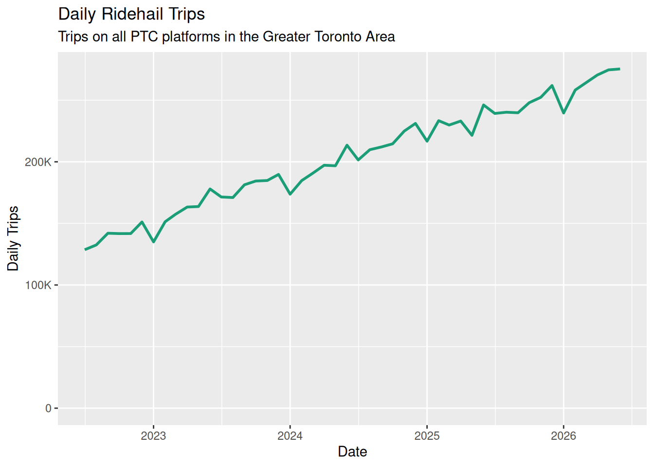
Figure 1 shows the average number of daily ridehail trips in each month, calculated from the Summary Stats data set.
250,000 trips per day is equivalent to just over 10,000 per hour, or about 175 per minute.
Active driver definitions
Throughout these charts, we assume that “vehicle count” and “driver count” are interchangeable. It’s still the case that “the number of drivers” is ambiguous. The focus here is on “active drivers” rather than “licensed drivers” (some of whom may never take advantage of the license).
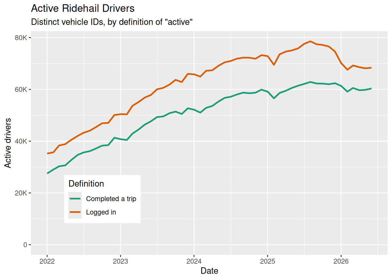
Table 2 counts the number of active drivers in a month two ways:
by login: any driver who has spent time on the app during the month, and
by trip: any driver who has completed at least one trip in the month.
Some drivers who login, but fail to get a trip, will be included in the former definition but not the latter.
The data set does not distinguish among platforms (Uber, Lyft) but does disaggregate vehicles, so that a driver on both platforms is not counted twice.
The dramatic change at the beginning of 2026 may be the result of reporting changes.
| Year | Logged in | Took a trip | Logged in, no trip | No trip (%) |
|---|---|---|---|---|
| 2022 | 42,283 | 34,323 | 7,960 | 18.8% |
| 2023 | 58,269 | 47,249 | 11,020 | 18.9% |
| 2024 | 69,763 | 56,056 | 13,707 | 19.6% |
| 2025 | 75,270 | 60,793 | 14,477 | 19.2% |
| 2026 | 68,801 | 60,359 | 8,442 | 12.3% |
Active drivers
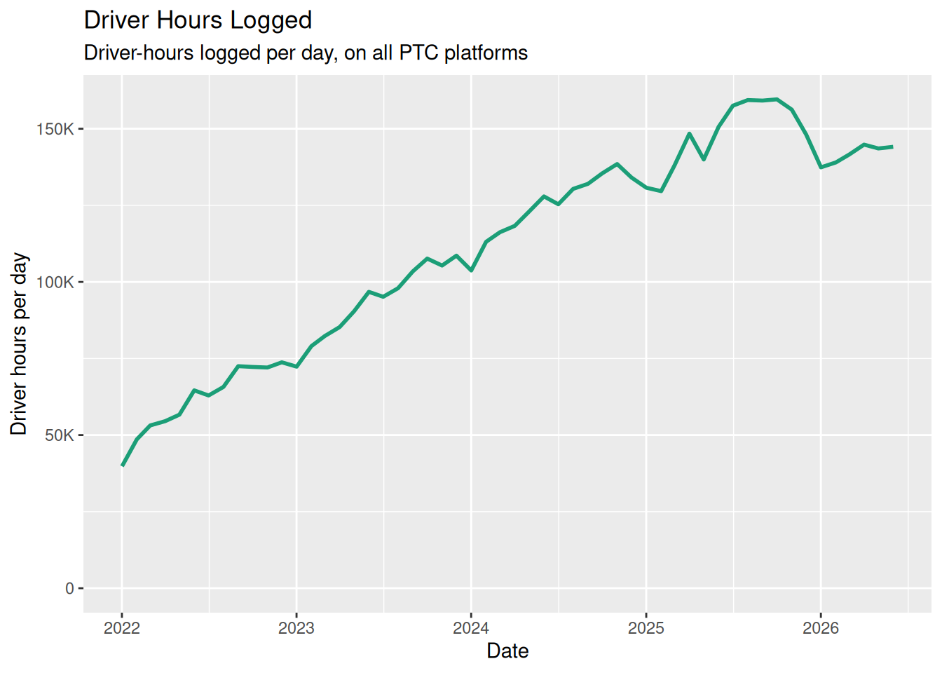
Figure 3 shows the driver-hours logged per day in each month, and Figure 4 shows the total number of active drivers each month under both definitions set out in Section 4: drivers who logged in to an app, and drivers who completed at least one trip. Drivers who log in but fail to get a trip are included in the “logged in” line but not the “completed a trip” line.
Total fares
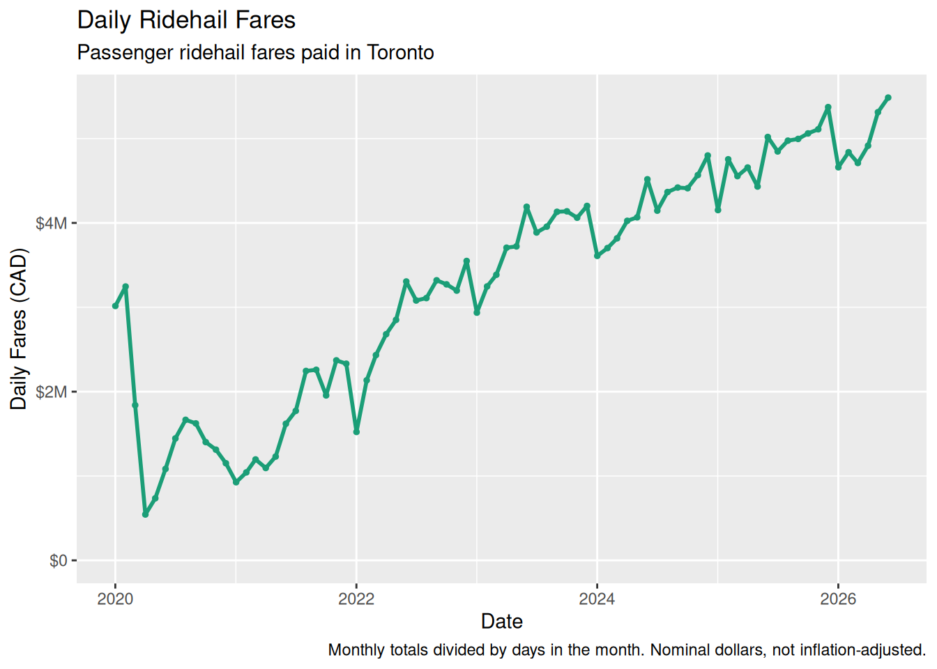
Figure 5 shows the total fares paid by ridehail passengers, as a daily average for each month. The Toronto data reports a single fare total, with no breakdown into base fare, tolls, or booking fees, so there is no Toronto equivalent of the Chicago additional-charges chart.
Trip characteristics
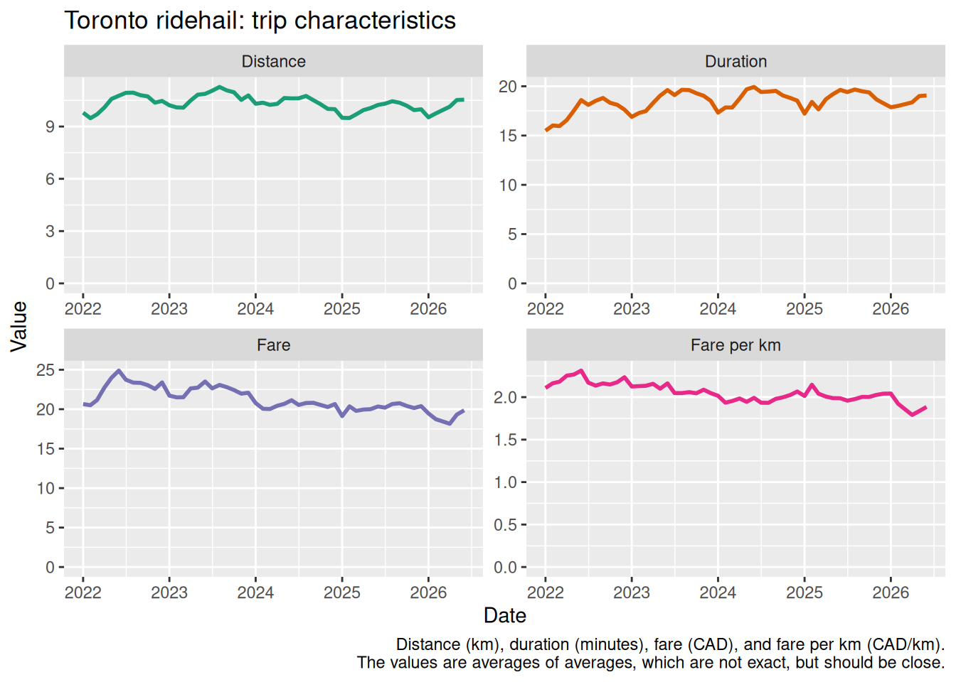
Figure 6 shows how average trip distance, duration, fare, and fare per kilometre have changed over time, and Table 3 lists the monthly values for 2026. The averages are “per trip”, and is computed from the Trips data set, which reports a mean for each hour ward-to-ward combination.
Fare per km is total fares divided by total distance, so long trips count for more than short ones.
Compare to the equivalent Chicago chart, which covers the same four characteristics in miles rather than kilometres.
| Month | Trips | Distance (km) | Duration (min) | Fare (CAD) | Fare per km (CAD) |
|---|---|---|---|---|---|
| January 2026 | 7,428,813 | 9.49 | 17.87 | $19.45 | $2.049 |
| February 2026 | 7,231,966 | 9.72 | 18.01 | $18.73 | $1.927 |
| March 2026 | 8,334,115 | 9.96 | 17.68 | $17.52 | $1.759 |
| April 2026 | 8,114,236 | 10.12 | 18.37 | $18.18 | $1.797 |
| May 2026 | 8,514,557 | 10.50 | 19.01 | $19.35 | $1.844 |
| June 2026 | 8,262,661 | 10.54 | 19.06 | $19.91 | $1.889 |
| July 2026 | 8,317,041 | 10.67 | 18.60 | $19.07 | $1.787 |
Supply and demand
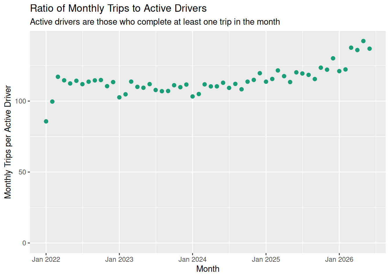
Figure 7 shows the long-term trend of supply (active drivers) and demand (trips), as a ratio of monthly trips per active driver.
Supply and demand: hour of the day
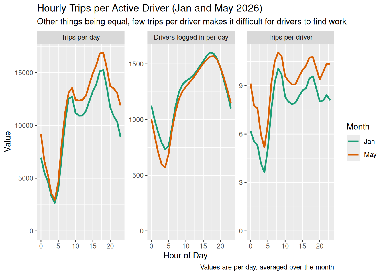
Figure 8 shows how the supply of drivers and demand for trips varies throughout the day. Each line shows an average over the given month.
Supply here counts drivers logged in during the hour, not drivers who took a trip in it: an hour spent waiting for a request is exactly what makes the trips-per-driver ratio worth watching, so the hourly counts keep the looser criterion that Table 2 sets out.
Cancellations
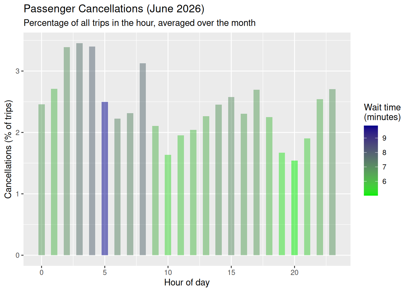
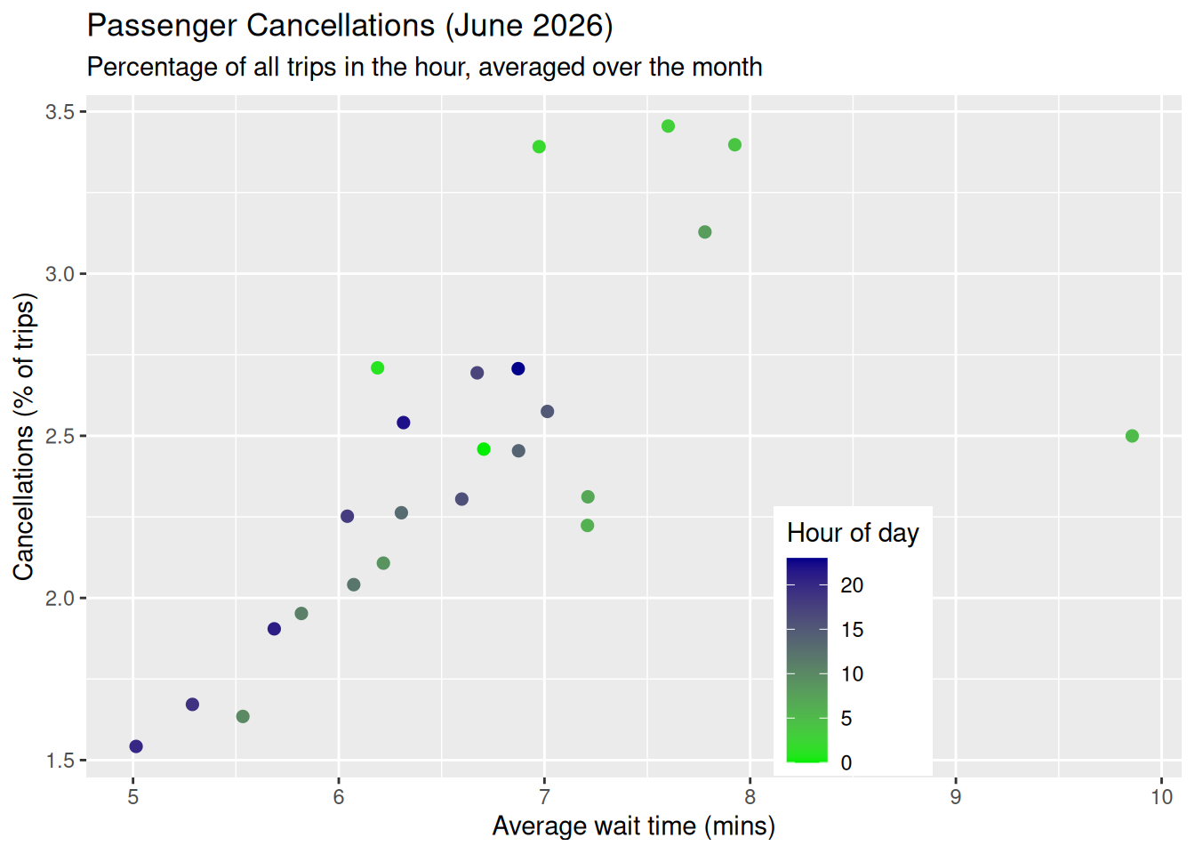
Figure 9 and Figure 10 show the passenger cancellations across the GTA in July 2026, and how they depend on the hour of day and on the average wait time.
The Chicago Trips data set records only completed trips, so there is no Chicago equivalent of these charts.
Fleet efficiency
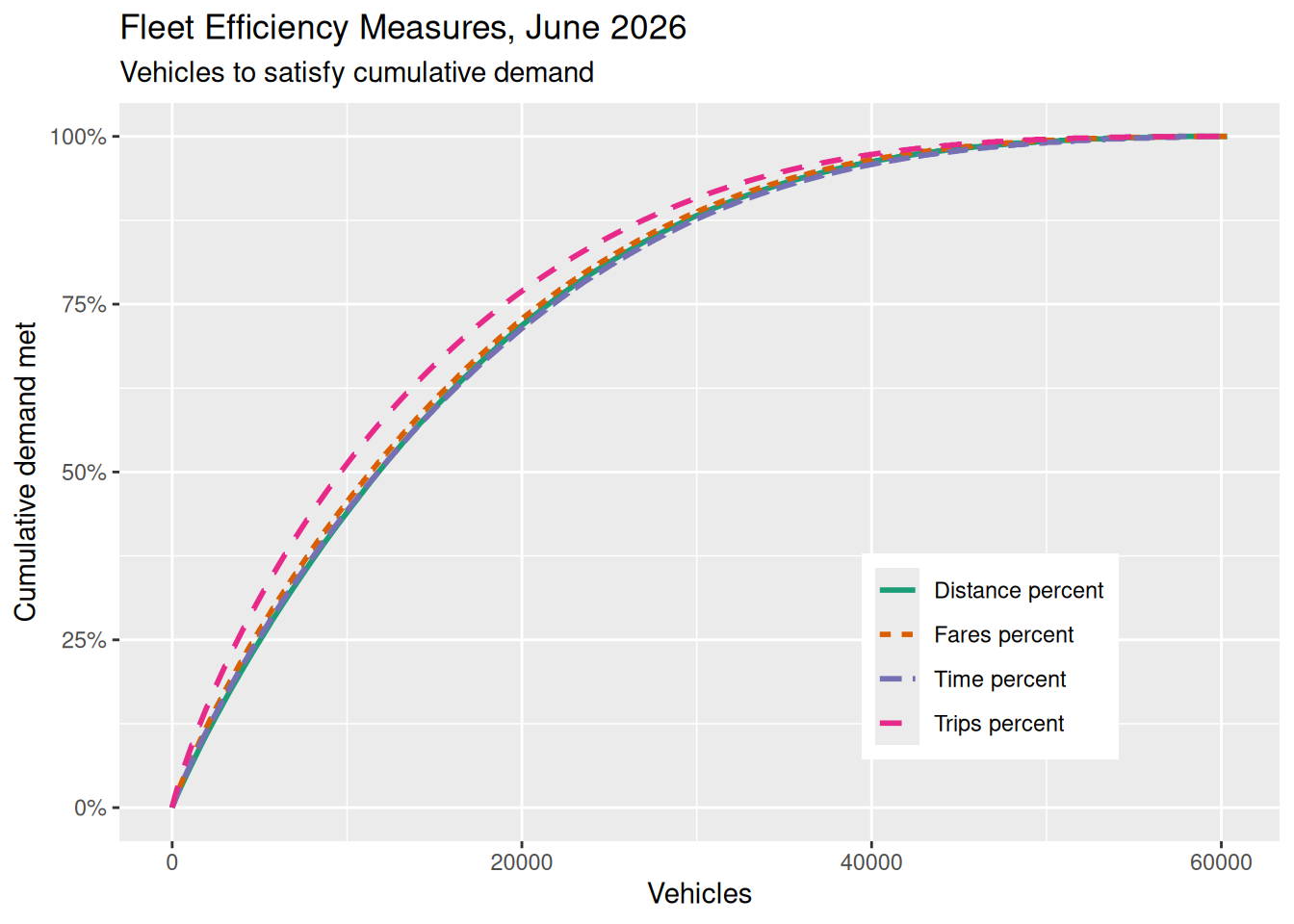
Figure 11 ranks every active driver by the number of trips they completed in the month, from most to least, and traces the cumulative share of all trips (or fares, or travel time, or distance) that they account for.
Fares
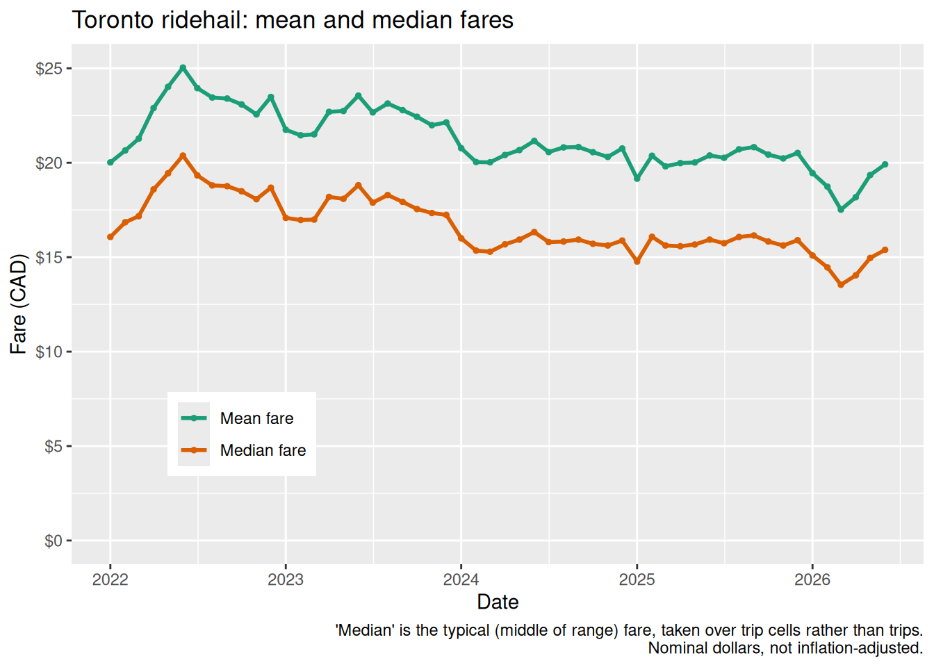
Figure 12 shows the mean and median passenger fare in each month.
The City publishes trips grouped into cells — one cell for each combination of day, hour, pickup ward, and dropoff ward — and reports the average fare for each cell rather than individual fares. The mean below is therefore exact (a trip-weighted average of the cell means), but the median is the trip-weighted median of the cell averages, which understates the true spread of individual fares.
Fare distribution
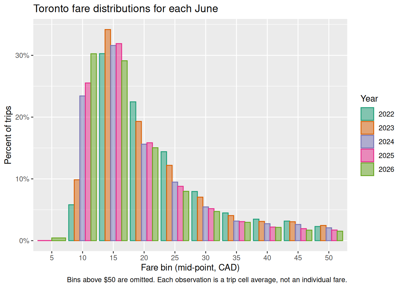
Figure 13 compares the shape of the fare distribution in the same month of each year.
As in the previous section, each observation is a trip cell rather than an individual trip, so the distribution is narrower than a true trip-level one would be. It is not directly comparable to the Chicago distribution, which is built from individual trips and uses $10 bins rather than $5.
Wait times and utilization
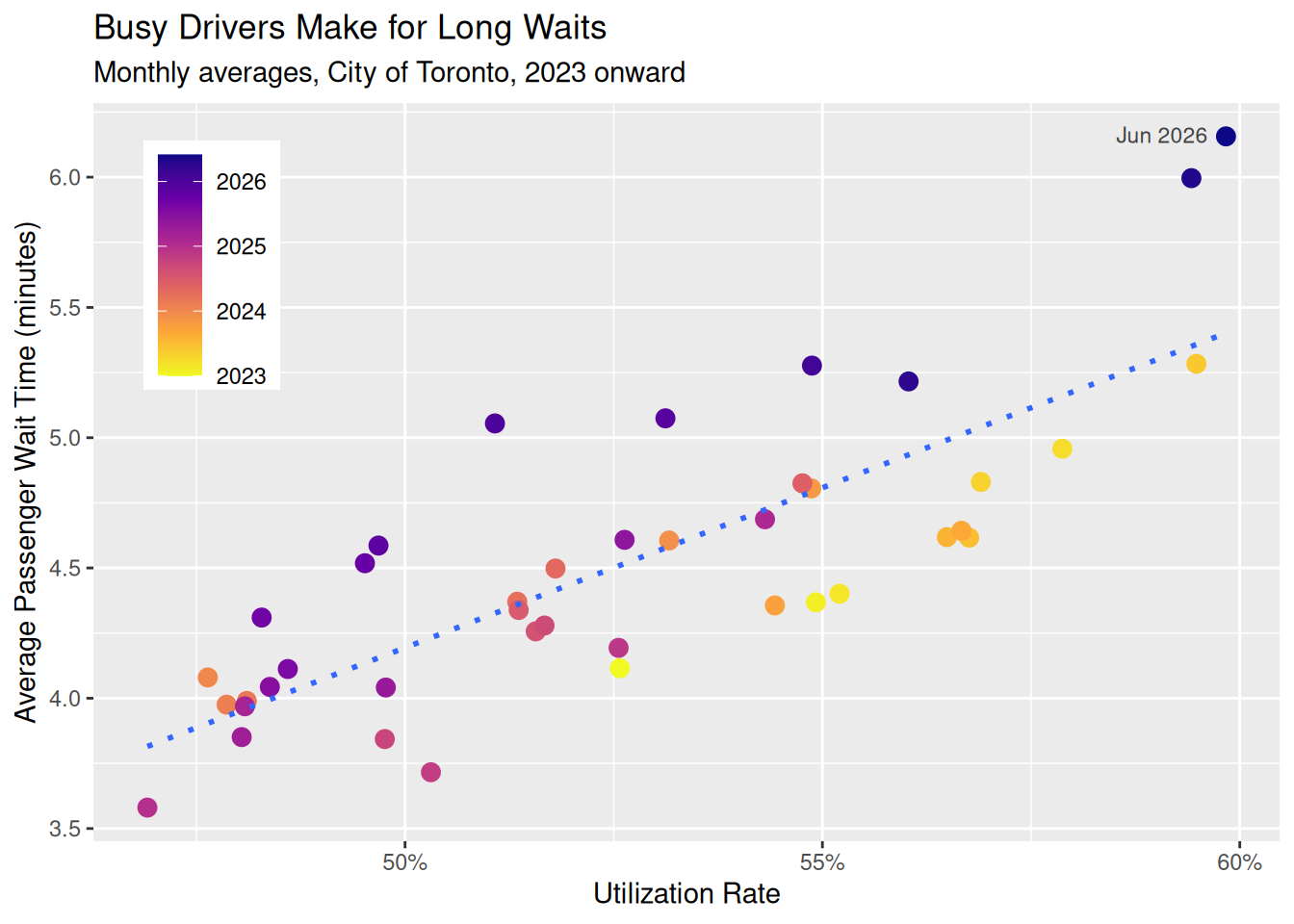
- Utilization rate:
time_ontrip / (time_available + time_enroute + time_waiting + time_ontrip), the fraction of a driver’s logged time spent actually carrying a passenger — the only time a driver is paid. - Average wait time:
waittime_avgfrom the Trips data set — the elapsed time from trip request to pickup, averaged over all trips, wheelchair-accessible included.
Utilization comes from the Vehicle Operating Hours data set (via its monthly rollup, oh_month); wait time is trip-weighted over the Trips data set’s hour × ward-to-ward cells, so busier times and places count proportionally more. Neither depends on the Summary Statistics data set, which lags the other two. Where the three overlap, utilization is identical to the Summary Statistics figure and wait time runs 0.4–1.8% above its non-WAV average, the gap being wheelchair-accessible trips’ longer waits.
Figure 14 plots monthly average passenger wait time against utilization rate from 2023 onward. Each point is a month-level aggregate across the whole city; there is no within-month or within-day detail here, just the long-run association.
Wheelchair-accessible vehicles
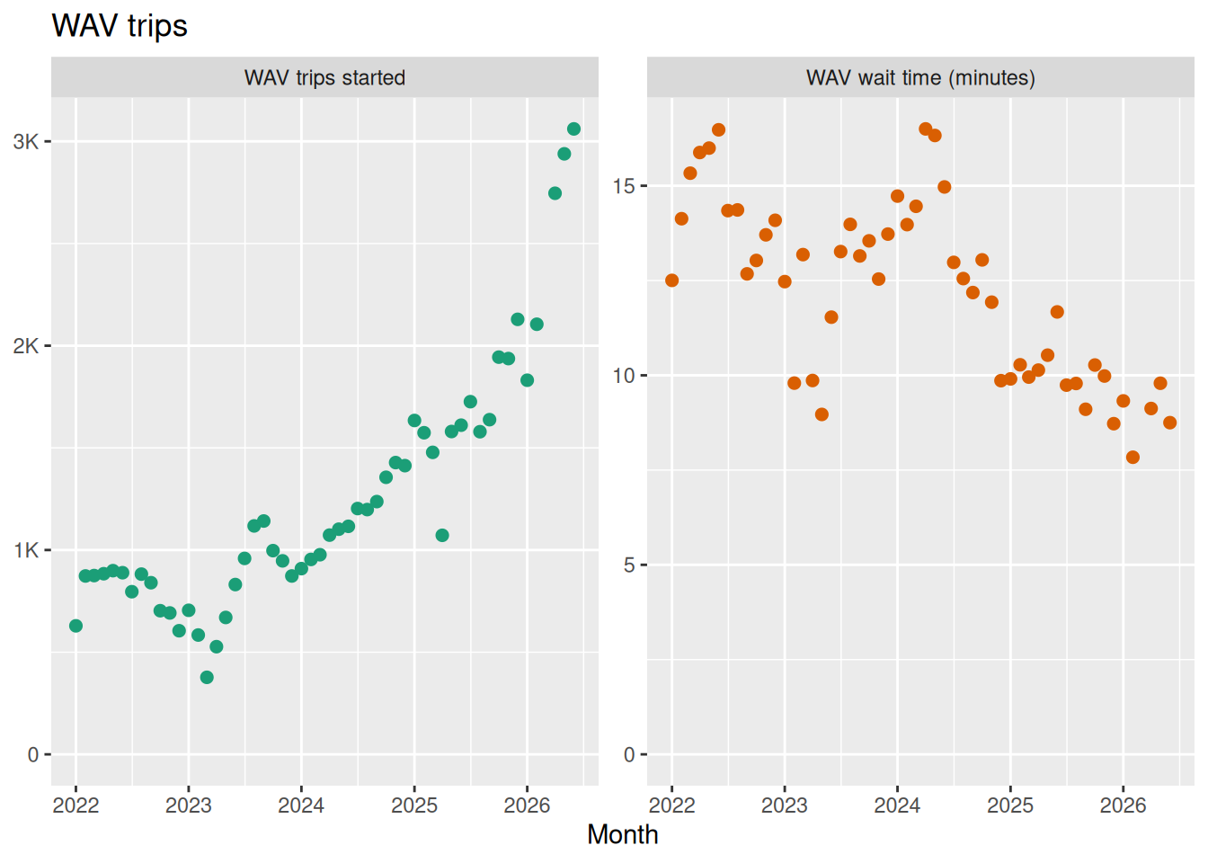
Figure 15 shows how many trips are supplied by wheelchair-accessible vehicles (“WAV” trips), and with what wait times.
The Chicago data set does not identify wheelchair-accessible vehicles, so there is no Chicago equivalent.